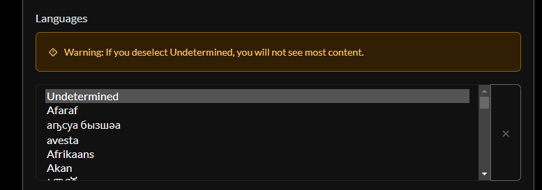
Hello,
I think it would be possible to improve the user experience of the language selection box.
Now:

Suggestion:
Pull requests are welcome.
deleted by creator
The list is super long, any good ideas on breaking it up? Or just allow typing to filter?
I’m a fullstack dev, and I wouldn’t be opposed to throwing a PR up for something like this. No promises though.
deleted by creator
Second image is not loading for me. On Jerboa
deleted by creator
Open a pull request?
deleted by creator
And that’s why Lemmy development is slow, lot of people have suggestions, but only a few can implement them
deleted by creator
You can make all the suggestions you want, but realistically they are probably not going to get implemented before a very long time, if at all.
deleted by creator
All good then!


