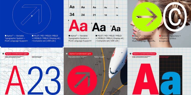
I like the friendlier feeling of Seaford (the o shapes have a little tilt to them rather than being straight on the grid), but I’m guessing they leaned towards the most “generic” of the five because as a default font you want it to become “invisible” almost. I think a more unique font would stand out and then become a little grating over time given how much it would be seen.


@leo I feel like some of the other suggested fonts were a bit stronger contenders than Bierstadt, though admittedly the name is awesome.
I’ll miss you, Calibri!
Agreed on the name.
As for the others, I’m a fan of Tenorite. Squattier than the rest, but it has the most “character”
I like the friendlier feeling of Seaford (the o shapes have a little tilt to them rather than being straight on the grid), but I’m guessing they leaned towards the most “generic” of the five because as a default font you want it to become “invisible” almost. I think a more unique font would stand out and then become a little grating over time given how much it would be seen.